How to use Pattern Effectively in the Home
Pattern is available in various forms, from curtains and cushions to throws, wallpaper and even pouffes, there are a multitude of ways to add interest to a space. It can however be quite daunting - you know your room needs something to draw the eye in but knowing how to use pattern can cause a little bit of decorating anxiety! We’ve therefore popped together a guide on how to effectively use pattern in the home so you can mix and match your favourite Voyage cushions with your extra long curtains to create truly show-stopping interior schemes.
It’s essential to attain the right combination of textures, shapes, colours and sizes to achieve a harmonious balance. The designs and colours that you choose will determine the overall ambience of your room, so think carefully about how you want your room to make you feel, whether that be happy, relaxed or energised.
Choose Complementing Colours
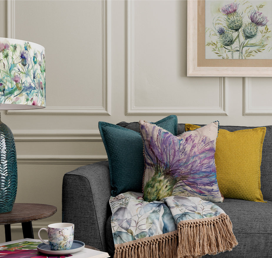
Incorporating too many different colours and patterns can make a room feel chaotic and cluttered, so we suggest opting for a base colour to set the tone of your room and using variations of this shade to create balance. Of course, it’s essential to add in accent colours for contrast, but we’ll come to that in more detail later. We like to use the 60:30:10 rule, whereby 60% of your room should be decorated in one dominant colour (neutral tones work well for this), with 30% your secondary colour and just 10% your accent colour to bring in that all important vibrant pop.
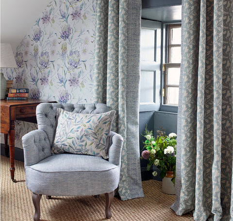
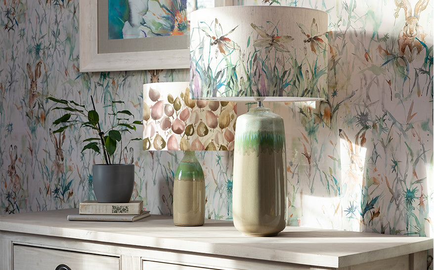
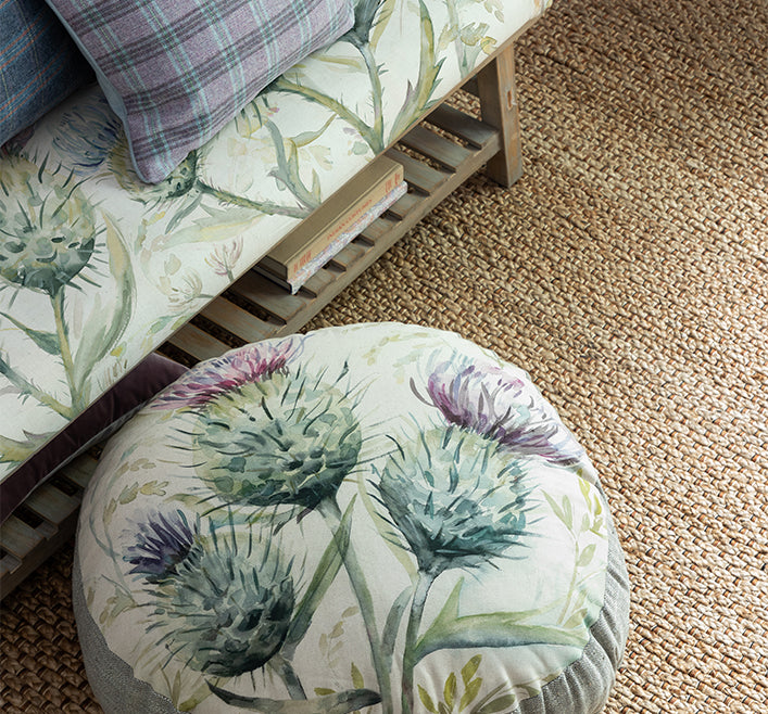
Choose Three to Four Patterns in Varying Sizes
Select three to four patterns and stick with these throughout your room. For example, opt for long drop curtains in the same print as your pouffe, and select a second pattern for your big cushions. The third print can be brought in with lampshades. Make sure your patterns aren’t of the same size, we suggest using larger prints for big cushions and long drop curtains, with smaller scale designs for your accent accessories to help balance out the larger patterns.
Mix Complex Patterns with Simple Patterns
Too many bold prints can quickly make a room look messy, so create contrast and combine a mixture of pattern, for example with tartan cushions and highland cow cushions in complementing tones for the perfect mix.
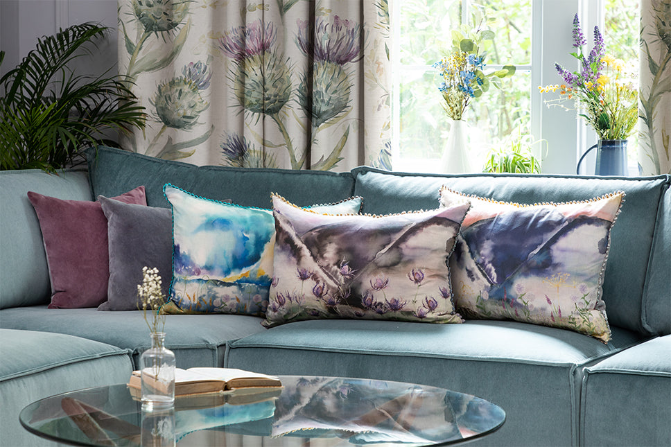
Bring in One Accent Colour
Subtle hints of your selected accent colour should be used in just 10% of your room. This should contrast with your base colour to create depth and add an extra level of interest to the space. You’d be amazed at how a subtle injection of colour can really bring a room to life. Our favourite accent colour at the moment is yellow, which we find is the perfect match to dark grey.
We hope we’ve inspired you to get creative with your interior and mix patterns. Simply stick to the 60:30:10 rule, mix up those pattern sizes and bring in a pop of colour for a super stylish interior that you’ll love.
We hope we’ve inspired you, on how to make the most of pattern within your home. Feel free to tag us on Instagram and show us how your best pattern styling! Catch up on all our latest updates and style guides read our blog here.